
Easy Line and Wash: My Tips and Processes
In this easy line and wash article and video workshop, we’ll be learning how to draw and paint Copenhagen and a suburban scene.
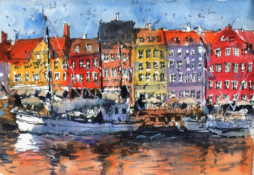
Copenhagan Scene: Process and Reflection
I really liked how this one turned out. Bear in mind that I was skeptical during the drawing process! viewers would have noticed me getting impatient when drawing in the little windows and frames. But I’m glad that I carried on and put in the extra details in the background.
My favorite part of this entire scene was the white of the boat on the left and the reflection in the water. The little white areas in the window frames also are great to create some extra contrast.
I find it always looks better when you leave the white of the paper in rather than use gouache at the end. Somehow it appears fresher and flatter.
The contrasting areas of a painting are very important too. Notice how I create multiple areas of high contrast near the large boat on the left to draw the viewer’s eye toward that section. The black areas within the boat and behind it really help to make it pop out. Especially near the white areas.
One of the things I would have changed would be to add a little more blue to the bottom of the scene and also through the top areas of the water. I’d forgotten all about the sky while adding in the warm reflections of the buildings and realized it would have looked better with some of the reflected cool colors of the sky in the water. Not only would it have been more accurate but it would have helped offset some of the warmth in the water. Mental note for next time.

Suburban Scene: Process and Reflection
This was a fun little scene, and I really liked the look of the cute van!
I put more time drawing in the van than other areas of the scene as it is the main focus, and due to the model of the car, it needs to be more representational than other subjects in the reference photo. I chose a greenish-blue background as it forms an almost complementary color to the orange of the van.
The darkness behind the van in the buildings and underneath also helps to create a stronger contrast which makes the van pop out more.
Remember if you’re interested in learning how to draw and paint these two scenes, check out the full video workshop here.
