
Watercolor Painting Composition Tips
This article will go through some essential watercolor painting composition tips to help you improve the flow and structure of your paintings. But firstly, why should you bother with composition?
When painting from a reference, it’s important to plan how you want to portray it in your painting.
Composition involves how you arrange all the elements on your sheet of paper. This can include things like where you place your figures, buildings/level of detail, angles, what colors you use, and specific values.
Line and Wash Painting Composition – Use orientation to your advantage
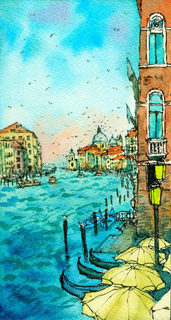
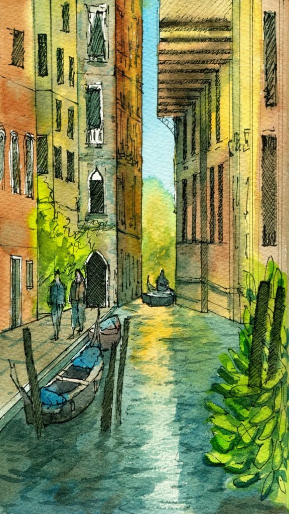
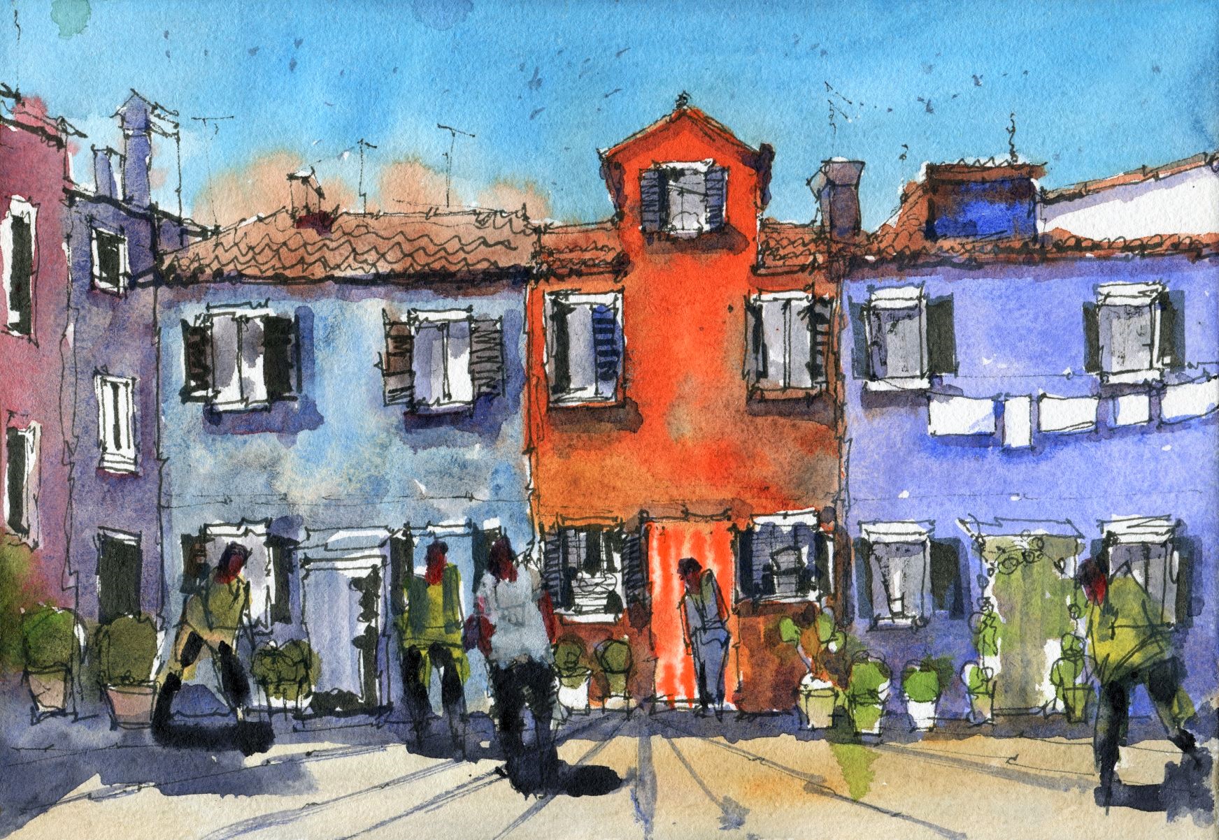
The three paintings below were part of a video series I put together last year. The drawings and compositions I’ve used in these three paintings are relatively simple. I chose a portrait orientation to allow me to focus on a small ‘slice’ of my reference picture (I basically cropped the image). This allowed me to eliminate all the extra buildings and details that did not contribute to what I wanted to portray.
In the first painting, this portrait style orientation allows me to draw the viewer’s attention to the umbrellas in the foreground and use that to ‘lead’ the eye into the painting. I put less detail in the background buildings so that the viewer isn’t fixated on that area and comes back into the mid and foreground.
In the second painting, I’ve again used this orientation to my advantage to portray a narrow walkway. I’ve placed figures in the sun, and in the shade to draw more attention to the light. Placing them at different distances also encourages the eye to move through the scene by creating a sense of depth. The use of exaggerated complementary colors (warm and cool) creates a feeling of vibrancy and adds to my personal style!
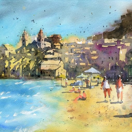
Watercolor Painting Composition – St. Mark’s Square, Venice
Below is a recent scene of Venice that I painted. Notice that I’ve used the rule of thirds here – a technique where you divide the scene into thirds vertically and horizontally. You then place the elements of interest in the corner areas where the lines intersect. Here, I’ve added the tower on the right third of the scene.
I’ve only used a few colors here. Some yellow/buff titanium for the light areas on the buildings, a little burnt sienna. The sky was mainly cerulean blue. Then I’ve added all the shadows and darker areas with some neutral tint. This helps make the colors in the sky and buildings pop out more as the other colors are relatively dull.
If you’re interested in watching the full tutorial on how to paint this Venice scene, you can watch it here.

Watercolor Painting Composition Tips – Composition in Abstract Painting
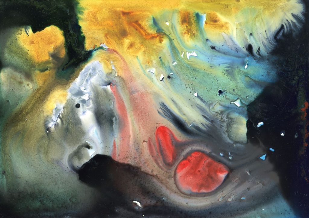
Here’s an abstract I completed in about 10-15 minutes. Abstracts help you to learn color theory and composition by allowing you to experiment in a low-pressure environment. It’s abstract! There’s no right or wrong.
However, there are a few lessons in composition that will help you create a more interesting-looking abstract.
What I’ve done below is added in the warm colors first such as yellow, red, orange. Then went in with some darker neutral tint, blue, in order to create dark and cool contrasts around the warmer colors. If I’d just left the warm colors without adding in any areas of contrast or change in hues, it may have looked plain and uninteresting.
The eye is often drawn to areas of high contrast first. In this example, it would be the areas where the black intersects with the yellows, oranges, reds. I created contrasts in each corner of this painting to encourage the eye to move in a circular motion around the entire scene, rather than stay fixated in one section.
So it appears that even in abstracts, there needs to be a level of structure and design to increase the overall effectiveness of the scene and message/intention.
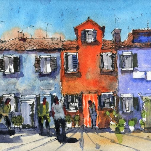
Line and Wash Composition – Focusing-in on a subject or feature
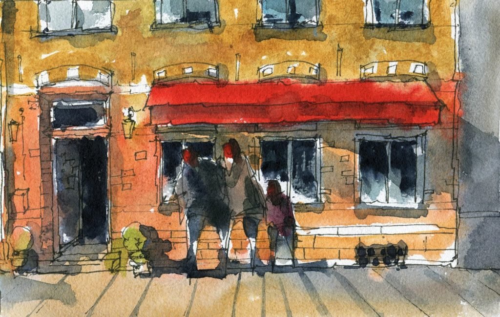
This scene here was fairly simple and I wanted it that way. I took a larger photograph and cut it down to a smaller section. I then drew and painted the scene below.
Creating a close-up scene like this draws the viewer’s attention to the figures and features of the buildings, the context of the landscape, rather than the actual buildings themselves.
In this scene, I wanted to imply a scene of a family going into a shop or restaurant, and in using a close-up shot of this scene and creating contrast with the darkness of the figures and the light on the buildings, was able to draw attention to the human subjects in this line and wash painting.
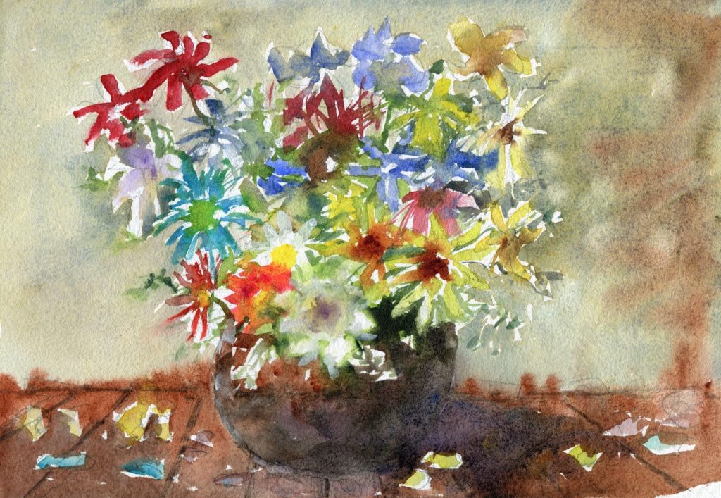
Composition in Floral Paintings
Here is a subject that I painted recently, a vase of flowers! Here I wanted a more subtle shift from the background to the flowers and opted for a softer and lighter green and brown hue in the background. I chose granulating pigments to create some textures and additional interest.
If you look at the flowers, most of them are of a darker tone compared to the background. This helps them to come forward more. The vase is a very dark tone, and I wanted to use that contrast to help draw out some of the flowers more at the base. I merged a darker shadow onto the right side of the vase too.
If you’re interested in learning how to draw and paint florals in watercolor, I have a few free videos here.
I hope you picked up some useful watercolor painting composition tips in this article. I run weekly live workshops which are available free from the link here.
Links and Extra Resources
Basic Materials (Affiliate Links):
Etchr Professional Black Drawing Pens – https://amzn.to/3d1zhil
Uniball Eye Drawing Pens: https://amzn.to/3letASU
Etchr Perfect Sketchbook – https://amzn.to/3n7ZQZm
Etchr Mixed Media Sketchbook – https://amzn.to/3DbFiEC
Daniel Smith Essential Mixing Set – https://amzn.to/3CaxD8e
Daniel Smith Secondary Watercolour Set: https://amzn.to/3nnr9yS
Daniel Smith Primary Watercolour Set: https://amzn.to/3Ct9cTV
Daniel Smith Mineral Mixing Set: https://amzn.to/3kP4YQi
Black Tulip Brush Set – https://bit.ly/2Scl7nM
Baohong 100% Cotton Watercolour Paper: https://amzn.to/30hNDs4
If you’d like to support me:
- https://www.buymeacoffee.com/darrenyeo
- https://paypal.me/watercolourmentor
- https://www.patreon.com/watercolourmentor
- https://watercolourmentor.com/courses/
Leave a comment below if you have questions & I’ll get back to you 🙂
Social Media:
- Facebook Page – https://www.facebook.com/watercolourmentor/
- Facebook Community – https://www.facebook.com/groups/watercolourmentor/
- Facebook Community – https://www.facebook.com/groups/watercolourbeginners/
- Instagram – https://www.instagram.com/watercolourmentor/
- Instagram – https://www.instagram.com/darrenyeoart/
My Courses:
- Official Course Website – https://watercolourmentor.com/courses/
- Skillshare – https://www.skillshare.com/r/user/watercolourmentor (Free 2 Week trial through this link)
