
This is my painting of Venice overlooking the Grand Canal (1/4 sheet, cotton Cold Press/medium texture):
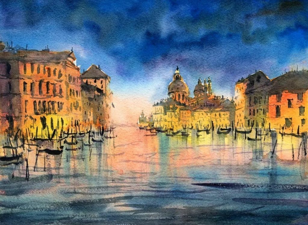
This was painted in two distinct washes. In the first wash, I painted the sky, warm areas on the buildings, and water in one go. I started with the buildings first, adding some lemon yellow, red, orange, and dropped some purple in whilst this layer was still wet. I carried some of the warm colors down to the bottom of the page and also added some yellow/red near the horizon line to indicate a sunset. The soft waves/cooler colors at the bottom were added whilst the foreground was still wet. Just drop in some purple, cobalt, or ultramarine + burnt umber. The cool colors in the sky need to be gently blended downwards so that it doesn’t take over all the warm colors in the buildings. Drop in some darker blues too in the sky whilst that area is still wet to imply some clouds. Leave to dry.
Next, all you need to do is start adding in the details for the buildings with a small round brush. I mixed up some darker paint consisting of primaries, ultramarine + burnt umber, purple, gray to paint in windows and darker areas of the buildings. I also added in a few large strokes of blue on top of the softer waves to get a combination of soft and sharp waves. The boats and wooden poles were added in last with a dark mix of neutral tint.
More free watercolour tutorial videos: