
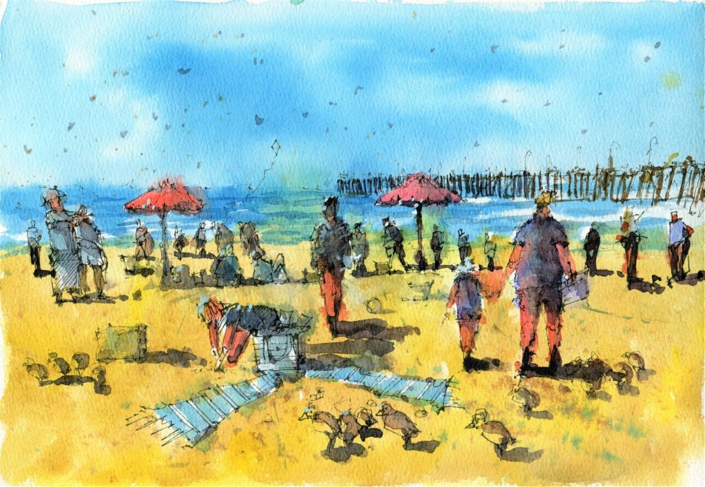
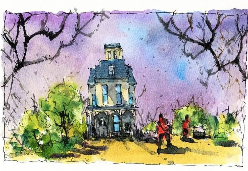
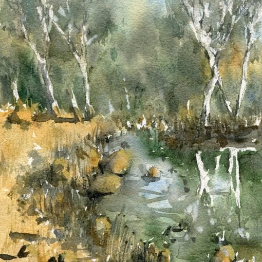
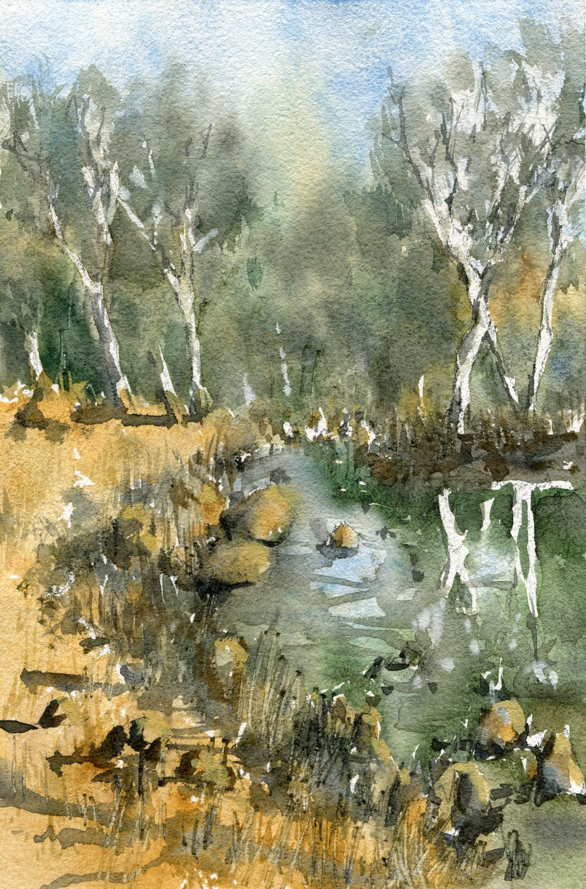
Here are a couple of line and wash sketches I completed during a free live workshop. The one below (beach scene) was done with pigment liners, and the house further down was done with ball-point, liquid ink pens.
This is largely a stylistic choice, but you can see pen lines in the beach scene are a lot more subdued, as the pigment liners allow you to control the strength of the line more than the ball-point ink pens. With the pigment liners, you just need to vary the pressure on the paper and you can get a lighter, broken line. Pigment liners also often come with a larger variety of nib sizes. The ones I use range from 0.05 to 0.8mm. Ballpoint liquid ink pens tend to dispense their ink faster and as a consequence, lines appear stronger even when drawing lightly.
I often swap between both types of pens. At the moment I don’t have much of a preference. I am trying to work with my pigment liners more as it seems I can get in more subdued lines which I like and is reminiscent of using a dark pencil for watercolor painting. For beginners, a $2 uni-ball eye pen from your local office supplies store will be sufficient for almost any line and wash painting.
Here are some tips on drawing with an ink pen:
- Hold the pen toward the end for a looser style, near the front for more detail and controlled style. Don’t grip too hard! This makes your lines too rigid and makes it harder for you to add small details.
- Before you start marking any solid, darker lines, plan light marks with your pen. You can do this by turning the pen on its edge so that it ‘grazes’ the paper slightly. Drawing with the side of the pen creating lines that skip areas of the paper. I use this technique to mark out the height and width of buildings, edges, horizon lines, large objects, and features before I completely commit to the line.
- Measuring with your eyes, fingers, pen – further to the tip above, I also use my hands and the pen to place imaginary lines on the paper or determine where I should place the edges of a building or subject.
- Hatching and cross-hatching – drawing a series of parallel lines running in one direction on an object or area of your drawing implies darkness and can be used to indicate a light source. Creating a set of diagonal lines on top of your existing hatching is called cross-hatching, and further darkens an area. Hatching can also be used to imply the curvature or dimensionality of an object. An example of this is drawing a series of curved lines on a circle to make it look like a sphere.
- Using different pen nib sizes – using a smaller nib allows you to add smaller details more easily and also pushes an object into the distance. A thicker nib is more suited to objects in the foreground as a thicker line creates the impression of closeness.
To view the entire live workshop for free, have a look at the video below:
2 thoughts on “Line and Wash Beach Landscapes – Ball Point Pens vs. Pigment Liners, Drawing Tips”
This is a fantastic guide for anyone interested in line and wash techniques! The comparison between ballpoint pens and pigment liners is very insightful, and it’s great to see how different tools can create unique effects in your artwork. The tips on drawing, like varying pressure for lighter lines, hatching for depth, and using different nib sizes, are especially helpful for beginners. I’ll definitely keep these pointers in mind for future sketches—thank you for sharing!
Glad you found this helpful Lana 🙂 -Darren